
Concept for Amazon
The parcel everyone's been waiting for
Full Amazon, no subtlety. The box is the classic kraft parcel with the orange smile arrow huge on the lid and smile-tape sealing every flap. Inside, black tissue bursts around pieces that all carry the smile — plus a toy delivery drone circling the unboxing.
What's in the set
- Echo Dot-style smart speakerHero pieceCharcoal fabric, pre-loaded with a greeting from the brand team.
- Mini parcel Bluetooth speakerA tiny kraft box with barcode print that is actually a speaker.
- Smile tumblerMatte black insulated steel with the orange smile arc.
- Prime-blue notebookOrange elastic band, debossed smile on the cover.
- Orange smile capFive-panel, embroidered smile front and centre.
- Parcel sticky-note stackMini kraft boxes that stack into a tiny fulfilment centre.
- Toy delivery droneHovering desk toy in the delivery livery.
- Delivery-day card"Your package has arrived" — the tracking number is the event code.
Packaging
- Kraft mailer-style rigid box with the orange smile arrow printed large on the lid
- Black smile-tape sealing every flap and a tear-off pull strip
- Black tissue burst and a mock delivery label as the card
The reveal
You tear the pull strip like any delivery — then the flaps burst open and the smile is on everything inside.
Colour direction
Brand guideline audit
Where this concept sits against Amazon's rules
1 of 3 checks need a change before anything goes to print. Colour, typography and logo use are reviewed separately.
Logo
Check before printRule: The smile arrow must run from A to Z and may not be used as a decorative swoosh.
In this concept: The orange ribbon forms a single curved arrow motif on the box.
Change: Print the smile only in its approved form on the lid; keep the ribbon as a plain orange band.
Colour
On guidelineRule: Amazon Orange on white or Squid Ink; kraft is a shipping material, not a brand colour.
In this concept: Exterior is kraft with one orange element; items inside are black and kraft.
Keep it this way: Acceptable as packaging, but any printed piece should use the official orange ink value.
Typography
On guidelineRule: Amazon Ember for brand communications, sentence case.
In this concept: Card copy is sentence case in a humanist sans.
Keep it this way: Swap to Ember at production.
Brand colour matching
Drop in your logo, see it on the boxes
Upload your logo and we read the colours straight out of it — or type them in. The packaging, ribbon and PR box below update as you go, and your palette travels with your order.
Logo
Readability check
- Primary: text reads clearly (12.4:1) in white.
- Secondary: text reads clearly (6.3:1) in near-black.
- Accent: text reads clearly (7.8:1) in near-black.
Ribbon, label and packaging text in the previews always switches to whichever tone stays readable on your colours.
More concepts
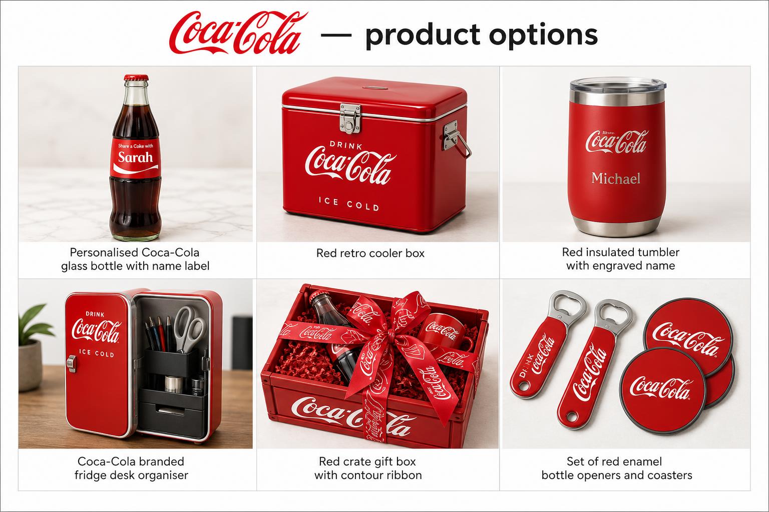
Coca-Cola
A cooler crate where every single piece is personalised — named bottles, engraved opener, printed name cards.
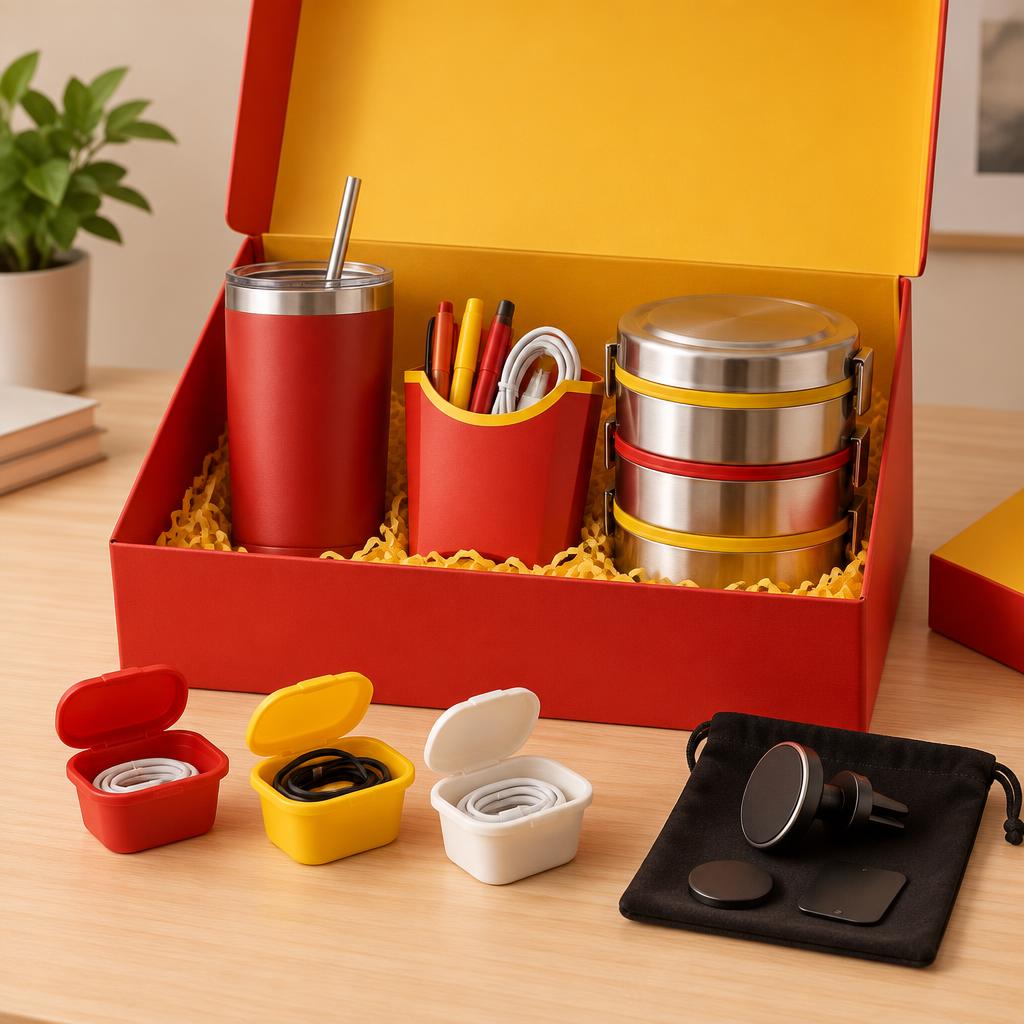
McDonald's
An all-day ritual box: McCafe commuter tumbler, fries desk caddy, burger-stack lunch box, sauce-pot cable organisers and a drive-thru car caddy — useful every single day.
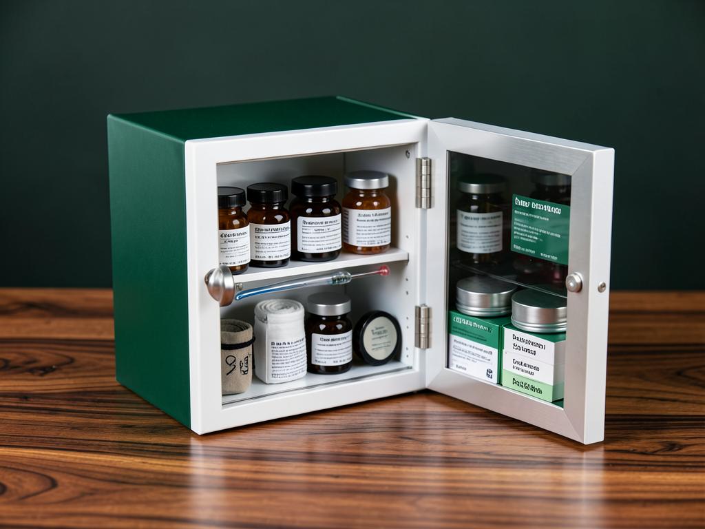
Aster Pharmacy
A mini medicine cabinet with a mirrored door — vitamins in amber jars, a first-aid roll and dosage cards.