Brand guidelines
How to write and show giftaya
One page, three rules: the name is always lowercase, the palette stays warm and premium, and the artwork is never redrawn or recoloured.
The name — always lowercase
giftaya is written with a small "g" everywhere: sentences, headlines, SEO titles, email addresses, social captions and legal footers. No exceptions — not even at the start of a sentence.
Correct
- giftaya
- "the art of gifting, by giftaya"
- hello@giftaya.com
- giftaya.com
Never
- Giftaya
- GIFTAYA
- GiftAya
- giftaya's → write "by giftaya" instead
The lockups
Two approved artworks. The lockup pairs the emblem with the lowercase wordmark and tagline; the emblem stands alone for avatars, favicons and seals. Always use the files as supplied — never redraw, stretch, recolour or add effects.
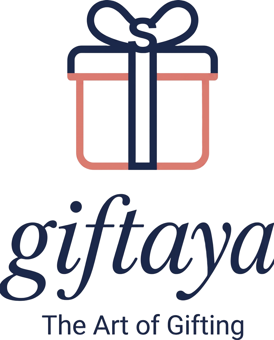

- Clear space: at least the height of the emblem's bow on all sides.
- On dark photos, place the artwork on a cream panel rather than recolouring it.
- No gradients, shadows, outlines or rotations.
- No other typeface locked up with the emblem.
The palette
Warm, premium, editorial. Coral leads every call to action; navy carries the words; the rest set the table.
Coral red · #F26A6C
Action colour — buttons, highlights, the gift-box ribbon.
Deep navy · #1F2A44
Wordmark, headlines and the emblem's box.
Terracotta · #C96F4A
Warm accents, secondary labels.
Walnut · #6B4F3A
Natural wood tones in photography and trim.
Cream · #FAF6EF
Backgrounds and breathing room.
Soft gold · #C9A24B
The knot detail — used sparingly, never as a fill.
Voice
Warm, witty and precise — like a concierge who wraps beautifully. Short sentences. No exclamation marks in headlines. British spelling, lowercase brand name, always.