
Concept for McDonald's
The happy meal, grown up and genuinely useful
Every piece borrows a familiar shape, then does a real job. The tumbler keeps coffee hot on the commute, the fries carton organises a desk, the burger stack is a leak-proof lunch box and the sauce pots tame cables — so the brand rides along on things people reach for daily, not toys they leave in a drawer.
What's in the set
- McCafe commuter tumblerDaily useDouble-wall stainless steel, 470ml, straw lid shaped like a McCafe cup — keeps drinks hot for four hours.
- Fries desk caddyDesk essentialPowder-coated steel in the classic carton shape: pens, cables, glasses, remote — all stood upright.
- Burger-stack lunch boxMeal prepThree-tier stainless bento with a silicone seal: bun lid, patty tray, salad base.
- Sauce-pot cable organisersTravel readySet of three silicone pots with snap lids — earbuds, chargers, adapters each in their own dip.
- Drive-thru car caddyCar kitVent-mount phone clip plus two coasters and a microfibre wipe, all in a pouch that hangs from the headrest.
- All-day ritual cardMorning, noon and night prompts — coffee break, lunch prep, commute wind-down.
Packaging
- Carry-handle meal box with a fold-back tray lid
- Gold foil inner print and red tissue
- Grease-proof paper wrap for each object
The reveal
The handle folds back and the tray is laid out like a breakfast spread — only every piece is built to be used again tomorrow.
Colour direction
Brand guideline audit
Where this concept sits against McDonald's's rules
1 of 3 checks need a change before anything goes to print. Colour, typography and logo use are reviewed separately.
Colour
On guidelineRule: Golden Yellow and Red are the primary pair; yellow is for the arches, red for surfaces.
In this concept: Box surfaces are red, foil and interior accents are yellow, charcoal is the only neutral.
Keep it this way: Keep charcoal as the only neutral so the pair stays dominant.
Logo
Check before printRule: The Golden Arches must not be turned into an object, prop or costume.
In this concept: The fries caddy and burger-stack lunch box echo brand shapes without reproducing the arch mark itself.
Change: Use the arch mark only as a flat printed logo; let the food silhouettes remain generic shapes so they read as homages, not logos.
Typography
On guidelineRule: Speedee/Lovin' Sans for headlines, sentence case, no outlines or drop shadows.
In this concept: Card and sticker copy is flat sentence case in one weight.
Keep it this way: No change needed.
Brand colour matching
Drop in your logo, see it on the boxes
Upload your logo and we read the colours straight out of it — or type them in. The packaging, ribbon and PR box below update as you go, and your palette travels with your order.
Logo
Readability check
- Primary: text reads clearly (12.4:1) in white.
- Secondary: text reads clearly (6.3:1) in near-black.
- Accent: text reads clearly (7.8:1) in near-black.
Ribbon, label and packaging text in the previews always switches to whichever tone stays readable on your colours.
More concepts
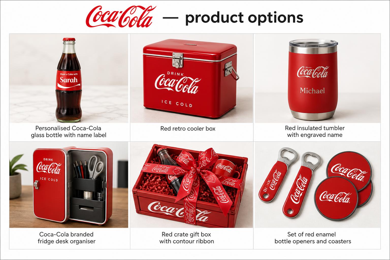
Coca-Cola
A cooler crate where every single piece is personalised — named bottles, engraved opener, printed name cards.
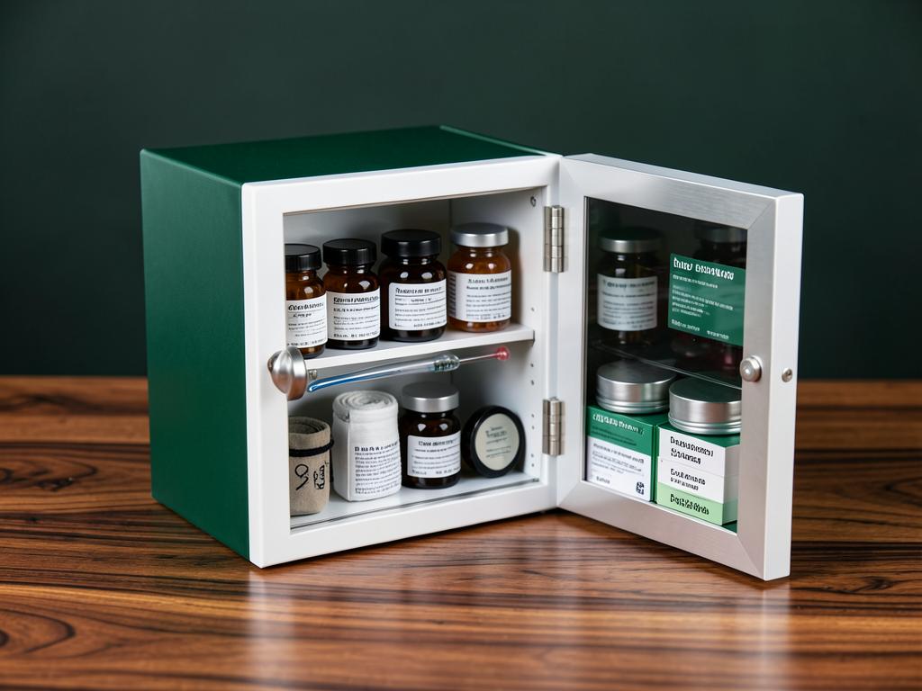
Aster Pharmacy
A mini medicine cabinet with a mirrored door — vitamins in amber jars, a first-aid roll and dosage cards.
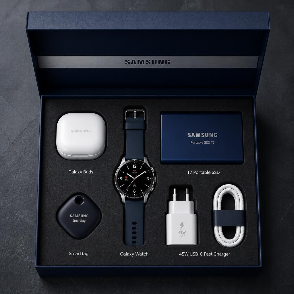
Samsung
A precision tech showcase box with real Samsung devices — Galaxy Buds, Galaxy Watch, T7 SSD, SmartTag and a 45W fast charger.